Easter Holidays (weeks 11, 12, 13)
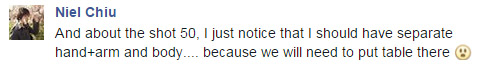
The Easter Holidays was quite a quiet time for my groups so I didn't have much to do.
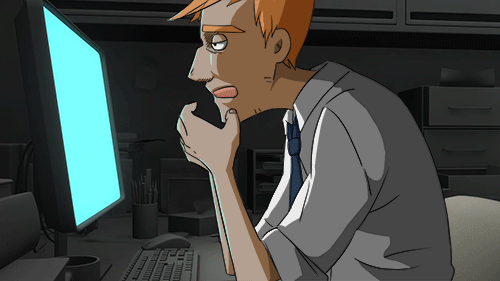
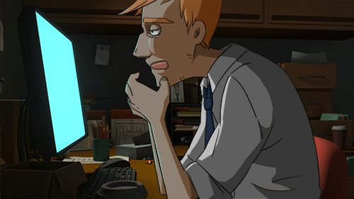
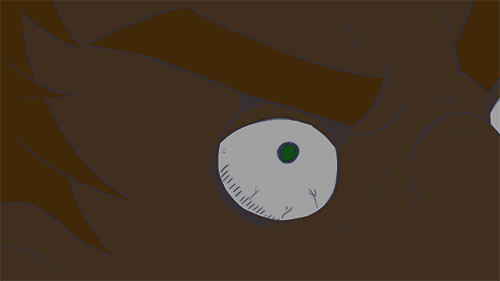
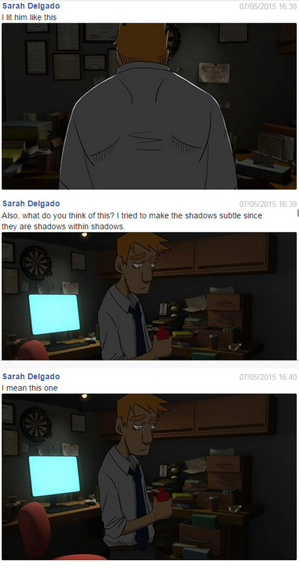
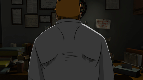
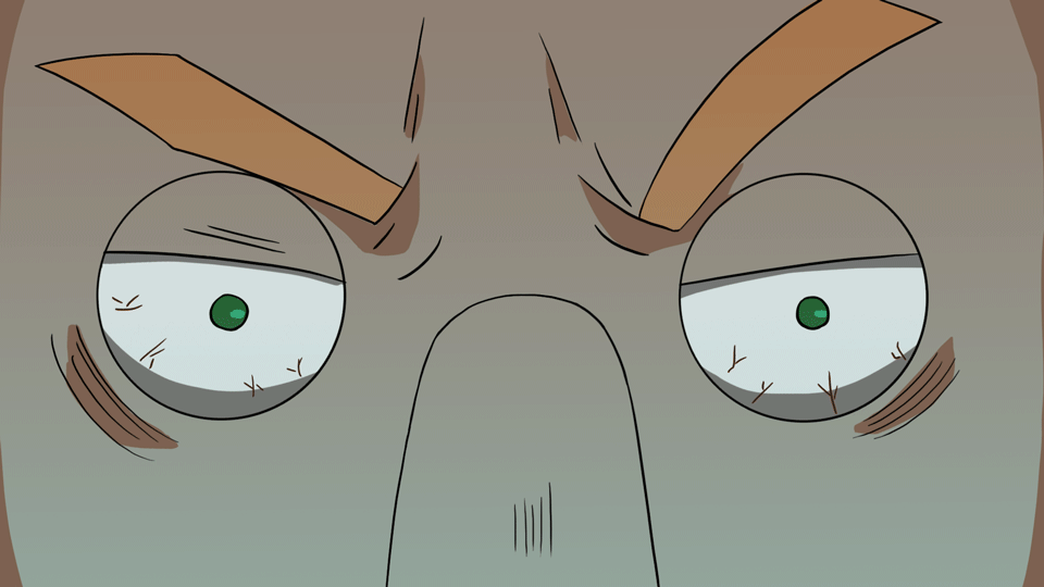
LO3: Here are my work in progress shots of my colouring. I did block colouring for most of it, but for shot 11 I went further and did shadows. The shadows are important to add depth and make it a little more believable that he is in the shot and sitting in front of the monitor.
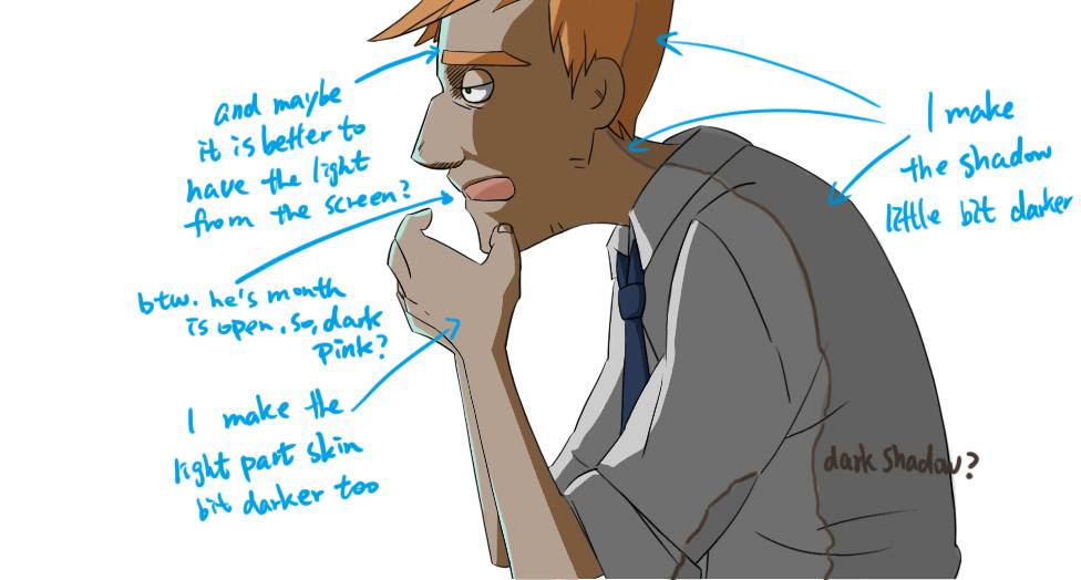
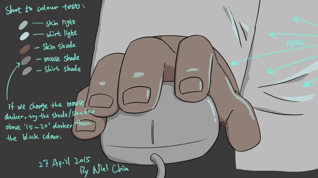
LO5: Niel wanted more shadows, so she gave me this visual note to let me know where she wanted shadows and highlights etc.
LO3 + LO5: Here is the shot I completed, with highlghts and shading. Niel thought iwas still too bright, so she tried a multiply layer over it to darken him.
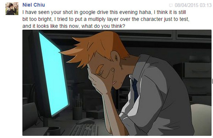
LO4: In the end I agreed and we made the darker shot the final coloured piece.
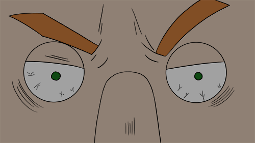
LO3: Below are some more shots I coloured quickly as they were really easy shots to do since they were close ups.
WEEK 14
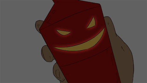
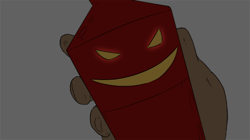
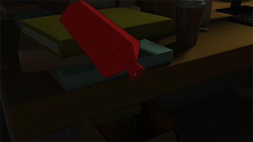
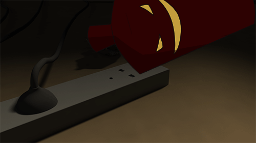
LO3: Here are some works in progress. I had to change the colour of the character's skin because I accidentally used the wrong colour. Also, I tried to make the bottle's features glow, but it didn't work so well.
|
|
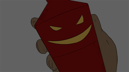
LO5: In the weekly meet up with the group, it was decided that it did in fact look as if the bottle had lipstick on.
LO3: General shots with the base colours. These are without the shadows and are static shots.
WEEK 15
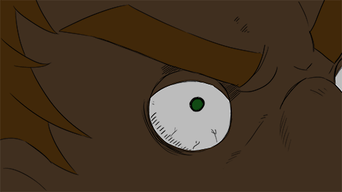
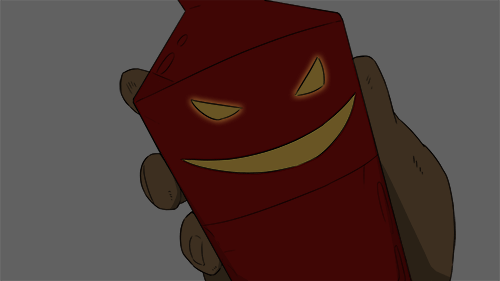
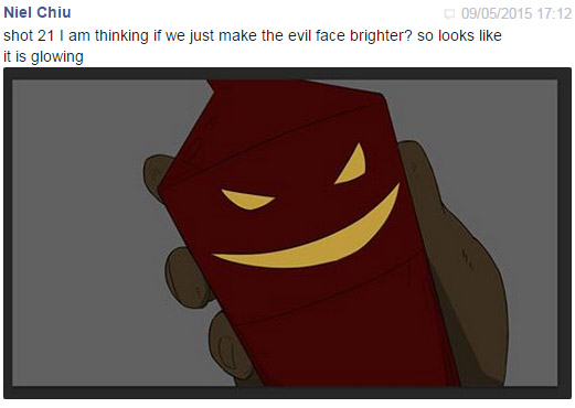
LO5: Niel had given me a few changes including seeing if the glowing eyes would work on the shot below.
LO3: Here are the works in progress I did for the shots. These are without shading, just the base colours.
LO3: Here are the works in progress I did for the shots. These are without shading, just the base colours.
WEEK 16
LO3: Here are a few in progress shots (shot 19 and shot 50) These are fully coloured, ready for Niel to check over, and with approval I would then colour.
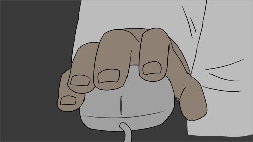
LO5: I sent off the block colours to be checked, but then Niel noticed a problem with the mouse shot.
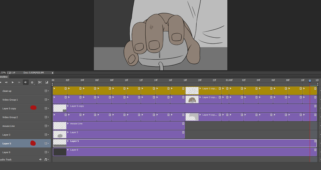
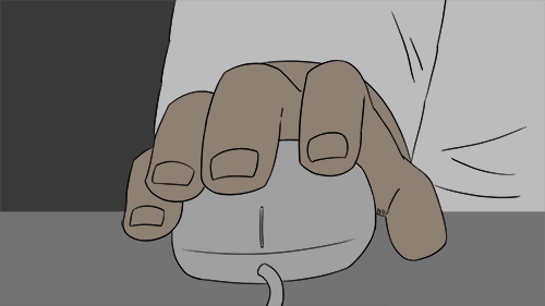
LO3: (Below) Here I merely added the table on the shot to make it seem like it was on the table. It was an easy solution in the end. You can see the layers I used to recreate the table.
|
|
LO5: I was a bit confused on what the shadows would look like on the mouse scene, so Niel gave me a quick breakdown of what it could possibly be like. Visual feedback is a really helpful tool and helps me understand a shot better.
LO6: We realised due to some of the clean up being late, the colouring had to be pushed a bit later. Thus we will start compositing around the 12th at the latest.
LO6: We realised due to some of the clean up being late, the colouring had to be pushed a bit later. Thus we will start compositing around the 12th at the latest.

Little Problems
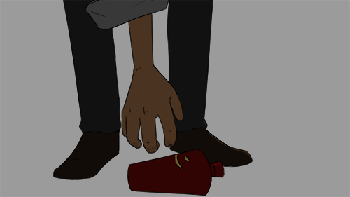
There were always these annoying little problems with colouring. I couldn't just fill in the shots with a paintbucket tool in Photoshop. I had to also draw around the edges, which took most of the time. Lucky I got faster, but this was a problem I had the whole time. Sometimes we could cheat however because the background was dark, sometime you didn't notice such things like the lines in the picture below.
There were always these annoying little problems with colouring. I couldn't just fill in the shots with a paintbucket tool in Photoshop. I had to also draw around the edges, which took most of the time. Lucky I got faster, but this was a problem I had the whole time. Sometimes we could cheat however because the background was dark, sometime you didn't notice such things like the lines in the picture below.
WEEK 17
LO5: Here Niel gave me some notes about how to colour this shot as I was getting a bit confused on how to add the blue parts.
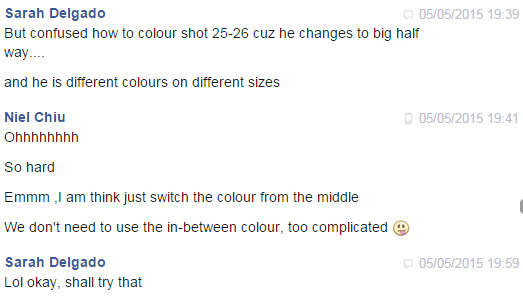
LO5: Here I was concerned about the colour change between, if we had to fade into the new colour or just switch instantly. Niel said no to do inbetween colours as it is too complicated. Thanks to the feedback I went ahead and coloured as usual.
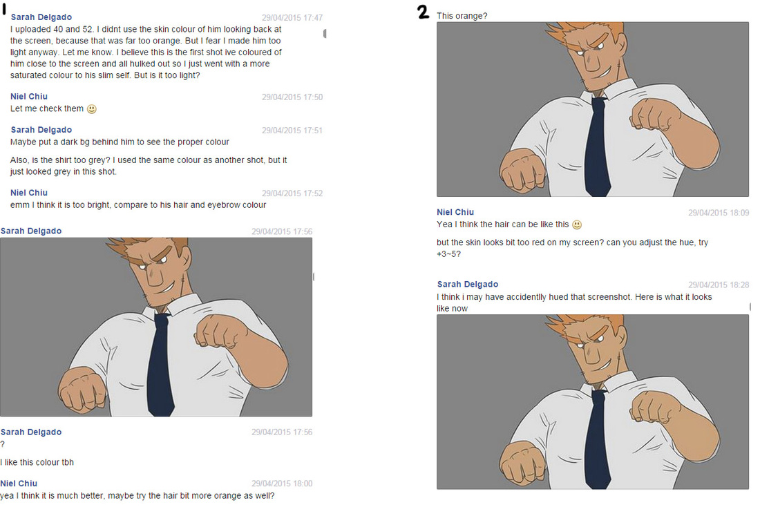
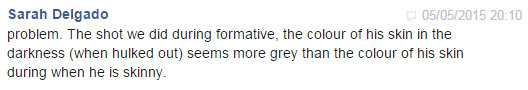
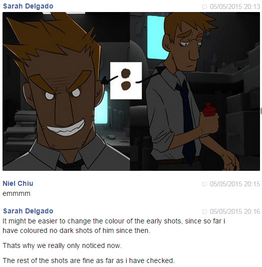
Below we also had the problem of the colours not looking correct when in the dark. Since we had not coloured a version of the character when skinny in the dark, we came across the fact he is more orange than the bigger version of the character. This should have been the other way round. I sent a message to Niel about this.
Below we also had the problem of the colours not looking correct when in the dark. Since we had not coloured a version of the character when skinny in the dark, we came across the fact he is more orange than the bigger version of the character. This should have been the other way round. I sent a message to Niel about this.
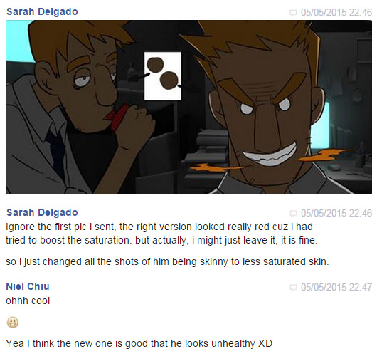
LO5: I sent samples back to Niel and tried to rectify the situation, which I eventually did by changing the skinny version of the character's skin colour on all the shots needed. I kept the original colour of his bigger version. I think it worked out well here.
|
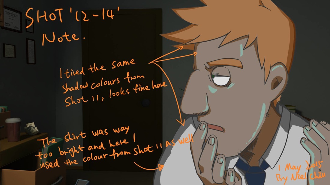
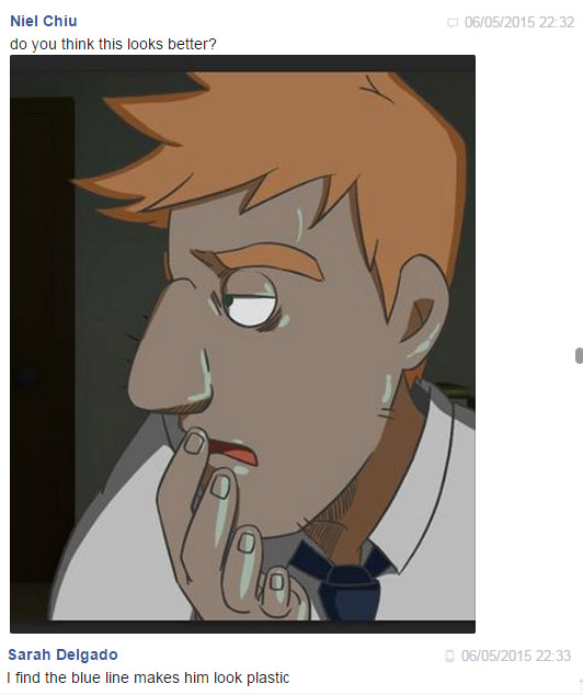
LO5: After having coloured the shot 12-14, I found that the addition of the blue lines looked rather awkward and made the character look almost plastic. Despite trying to lower the opacity or change the blue colour, we decided it was best to take off the blue lines altogether. Niel then went and did a test with a blue gradient to mimic the soft screen light and immediately it seemed more natural and just better.
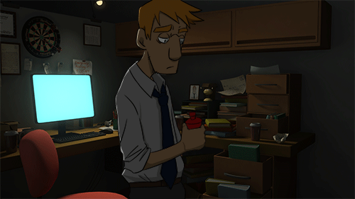
LO4: Above is the final shot we will have for the final piece. (Blue light added by Niel) |
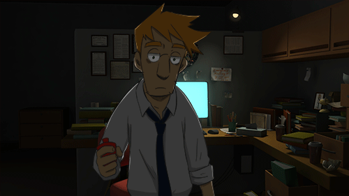
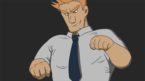
LO4: (Below) Here is one of the final shots for the final piece I completed in colour and shading. As you can see he changes colour and size half way, which I find highly amusing!
|
LO5: (LEFT) I always made sure to check in with Niel if a shot looks okay. I would send the coloured shots via Google Drive or use a screenshot and ask if the shot looked okay before proceeding with shadows.
(Above) It became very apparent that I could not get every shot fully shaded as there were still shots that had yet to be sent that needed colouring. I asked Niel if there was anyone who could possibly do some of the smaller shots to help out, and Niel took it upon herself to do the job. I was extremely grateful!!! So I made sure to send her important notes that she would need to help colour, such as colours to use. |
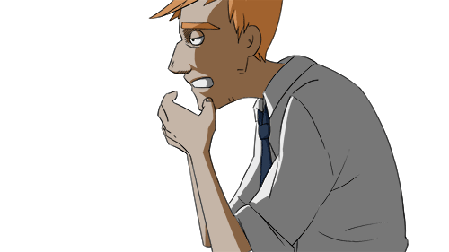
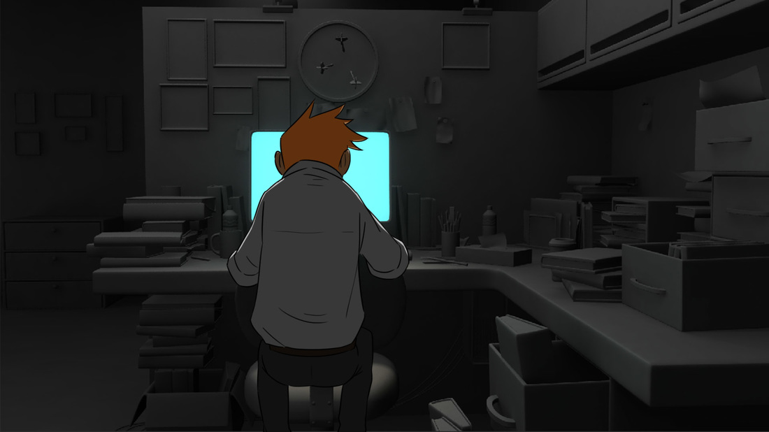
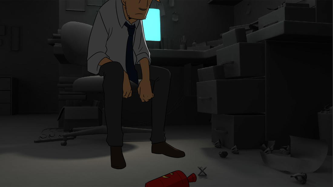
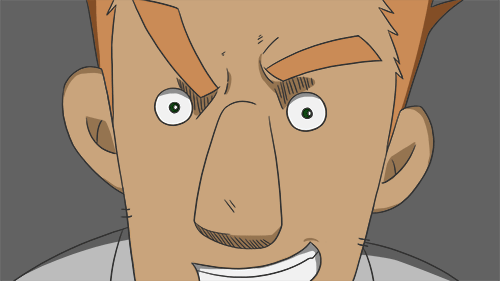
LO4: This is a shot of him after having sat down and him prepping to work. He moves and even rips his shirt! I think Niel's animations are always really fun and fluid, and placing the colour and shading over it just makes everything pop and look even cooler. Despite this seeming like a simple shot, this took a while as I wasn't sure how much shadow to put within the already shadowed portions. It came out quite nicely however in my opinion.
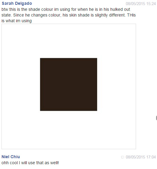
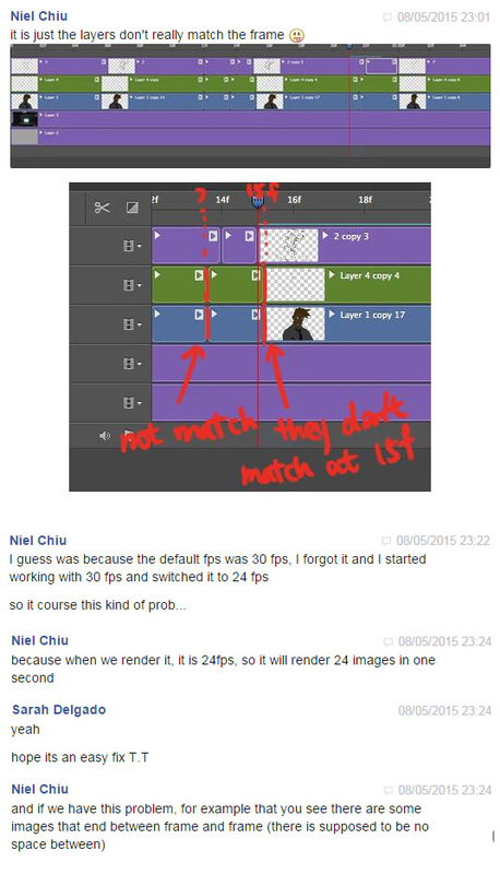
LO5: This was something I definitely need to remember. Niel had accidentally started this animation in 30 fps, when we were going to render in 24fps. This would thus affect the animation. I had coloured everything not noticing this problem as well, so Niel had to gi in and fix everything.
LO5: (Above) I just wanted to show how we communicated for almost every shot. I would do a shot, Niel would either send me feedback, or if it was something she could change quickly, she would change herself. It felt very efficient and worked well.
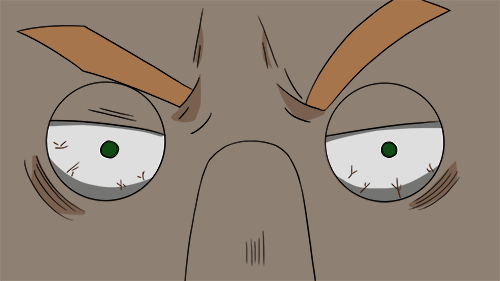
(Below) Again, this is an example of an original image I did and then Niel making the changes where necessary. In this case it was the eyes which I found appropriate. So my original I made the eyes glow, but in her edit, she made the eyes glow by simply brightening the eyes. We decided that the blue lines looked awkward, so instead Niel devised a really smart was of portraying the blue by using a blue gradient overlay over the image to make it seem like the screen was shining on him. It also didn't make him look plastic.
(Below) Again, this is an example of an original image I did and then Niel making the changes where necessary. In this case it was the eyes which I found appropriate. So my original I made the eyes glow, but in her edit, she made the eyes glow by simply brightening the eyes. We decided that the blue lines looked awkward, so instead Niel devised a really smart was of portraying the blue by using a blue gradient overlay over the image to make it seem like the screen was shining on him. It also didn't make him look plastic.
|
|
LO4: Here are some more of the final shots I coloured and what they look like coloured fully with shading. These were some of the last shots before compositing.
|
|
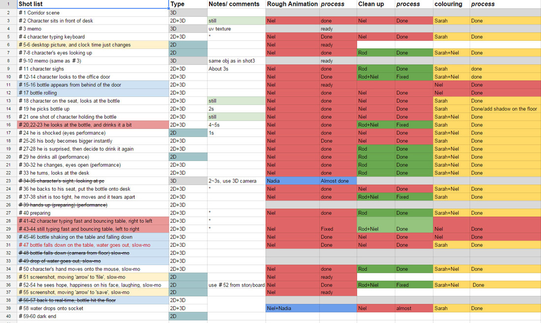
(Below) You can see the shotlist and calendar that Niel made. My parts are in yellow. Where it says Sarah + Niel were either shots she added shadows to or did final touch ups/adjustments if she thought they needed it (like a simple gradient over everything). We worked really well as a team, but our director was definitely the superhero here!