Marking Criteria Colour Key:I will mark each of the following criterias in specific colours.
LO1 = Red LO2 = Blue LO3 = Green LO4 = Yellow LO5 = Pink LO6 = Light Blue |
|
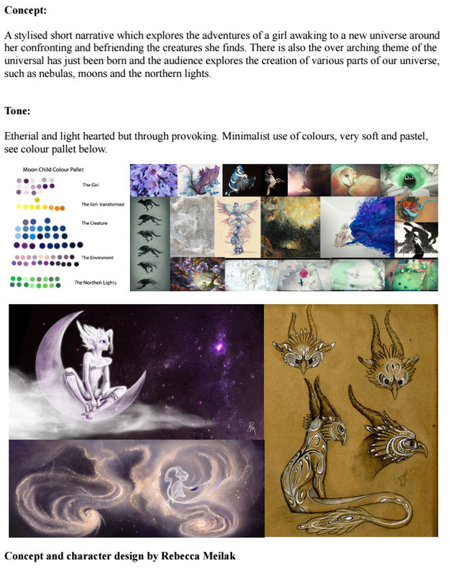
concepts
WEEK 1 of Term 2
Coming into this new term, we were briefed on the new term and what is expected of us with the continuation of our Final Major Projects. By this time, I had not planned on working on Moon Child, thus did not work on it during.
WEEK 2 and 3
Rebecca (The Director of Moon Child) asked if I could do some concept/mood pieces for her and draw up some of the storyboard shots she had done in colour. She had wanted to see her shots in full colour and thus asked me. She also wondered if I would be available as a background artist for later, which I said was possible.
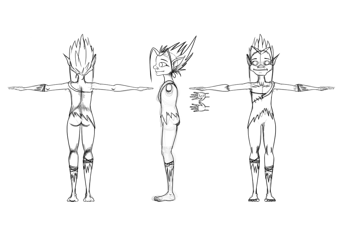
LO1: So for Moon Child I ended up becoming a concept artist and background artist. I knew my biggest challenge was to keep to a similar style and feel to Rebecca's early concepts and characters but make the concepts at least my own.
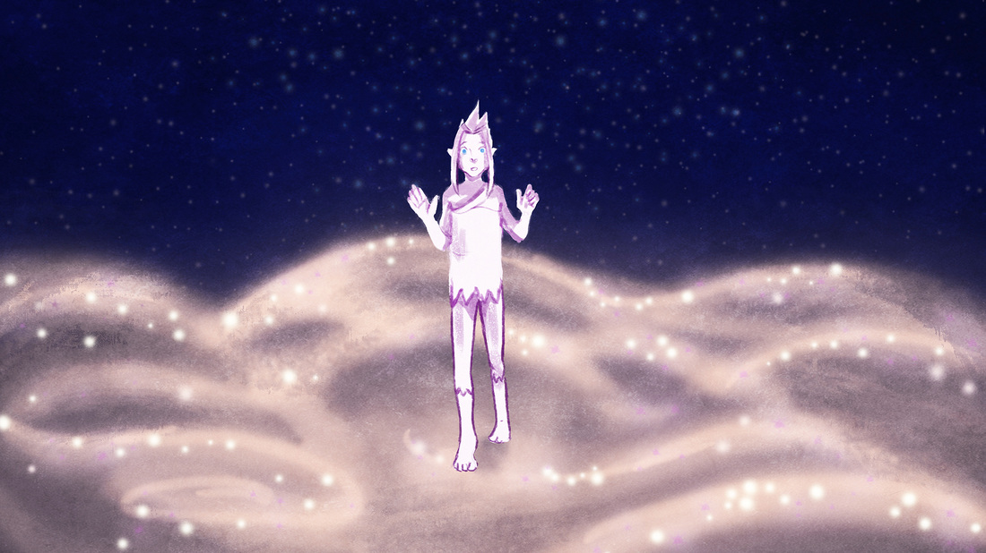
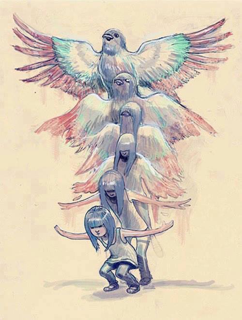
I went straight into concepts with the first 3 shots she asked for. I was given a treatment and a single image of a girl transforming and started to design the world with my own vision.
LO2 I seldom use reference if I already have an idea of what it is I want to do or how something looks. Especially with a brief like this that is in space. I don't want to get too involved in making a concept look exactly like something already out there, so I trust myself to go for it first.
LO1: So for Moon Child I ended up becoming a concept artist and background artist. I knew my biggest challenge was to keep to a similar style and feel to Rebecca's early concepts and characters but make the concepts at least my own.
I went straight into concepts with the first 3 shots she asked for. I was given a treatment and a single image of a girl transforming and started to design the world with my own vision.
LO2 I seldom use reference if I already have an idea of what it is I want to do or how something looks. Especially with a brief like this that is in space. I don't want to get too involved in making a concept look exactly like something already out there, so I trust myself to go for it first.
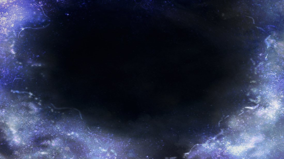
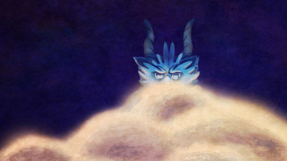
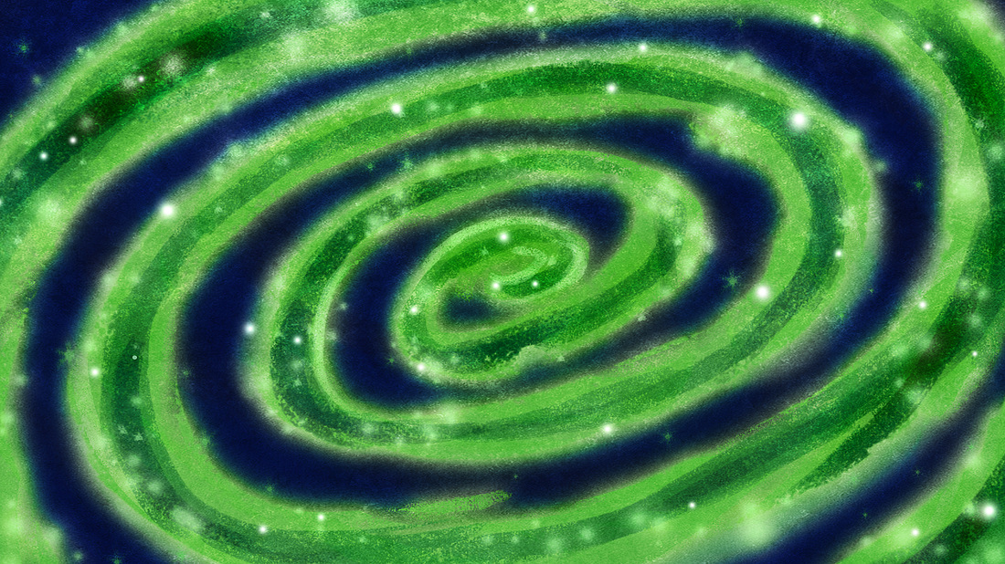
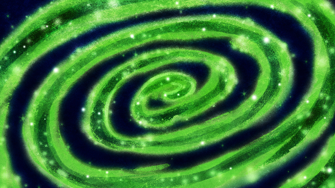
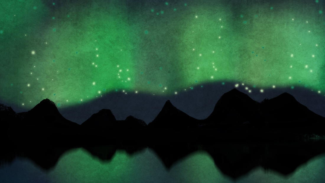
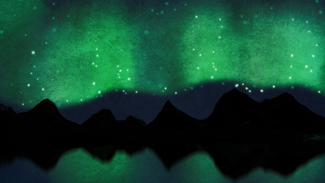
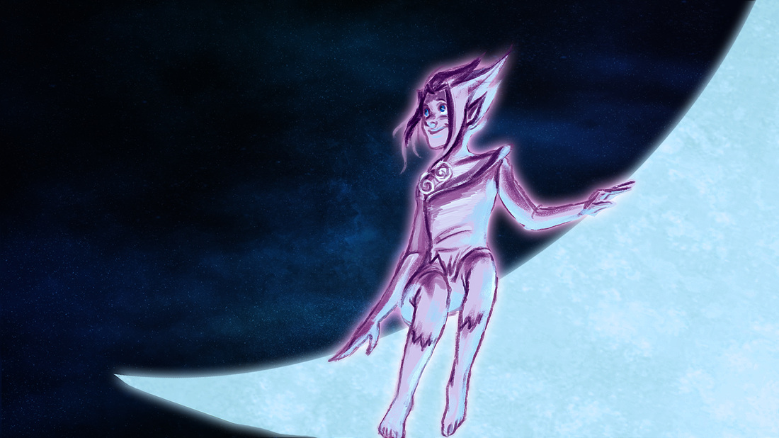
LO3: (Above) These were the two concepts I finished first and fairly quickly. I had a paper copy of one of Rebecca's storyboards, and based this after one of her shots. There wasn't any explanation on what these shots were, but the storyboard image, the idea that it was in space and the colour palette allowed me to envision something like the above.
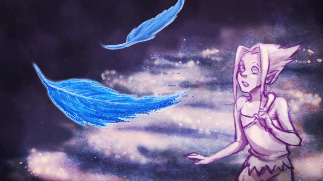
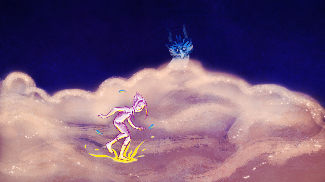
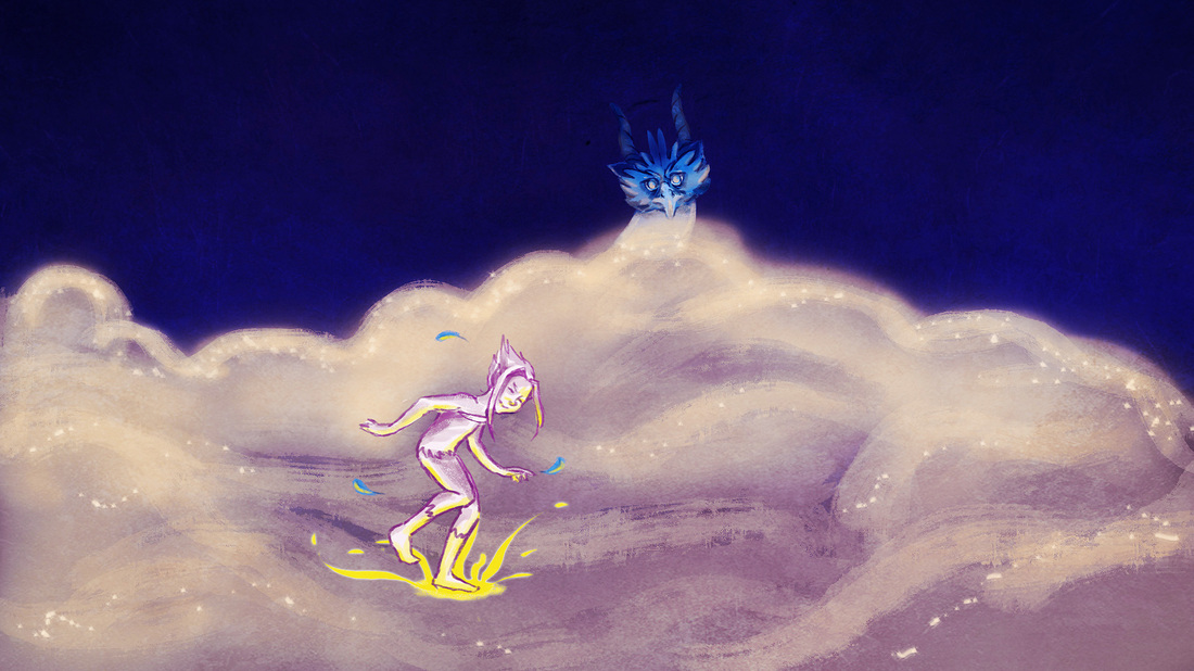
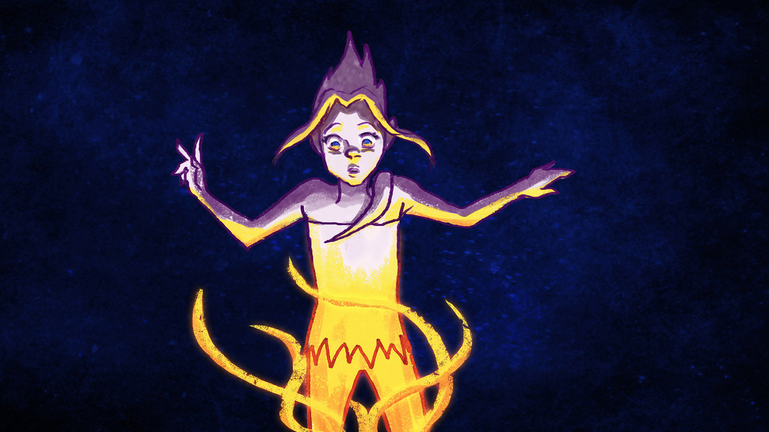
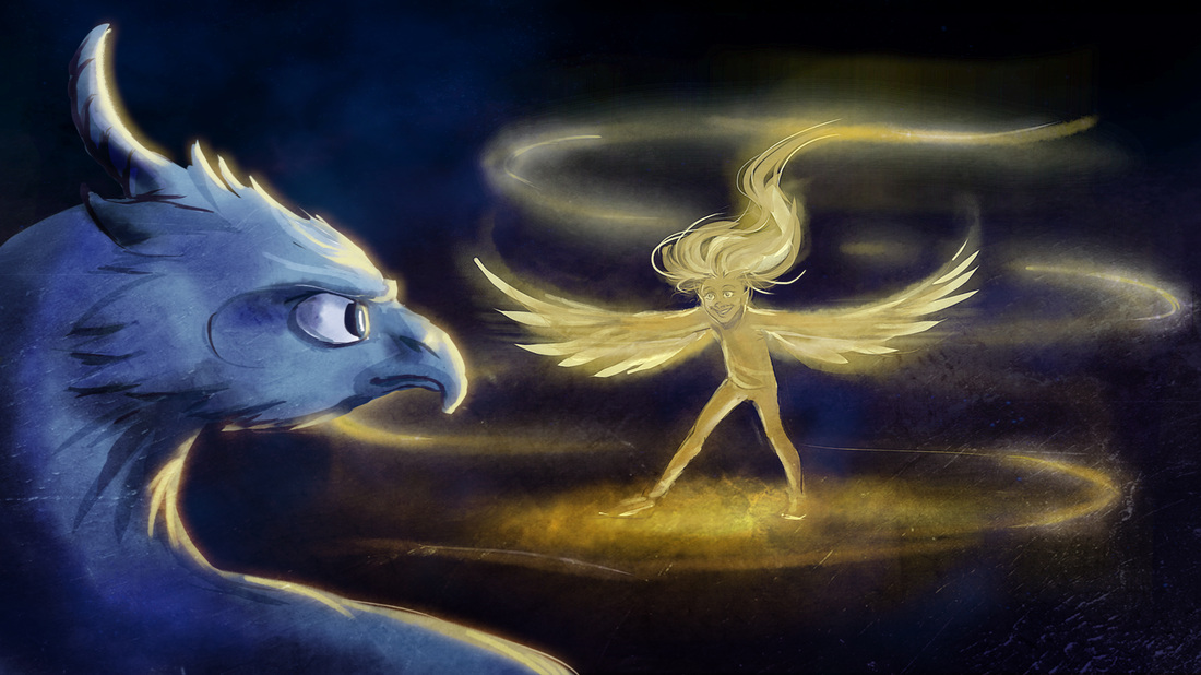
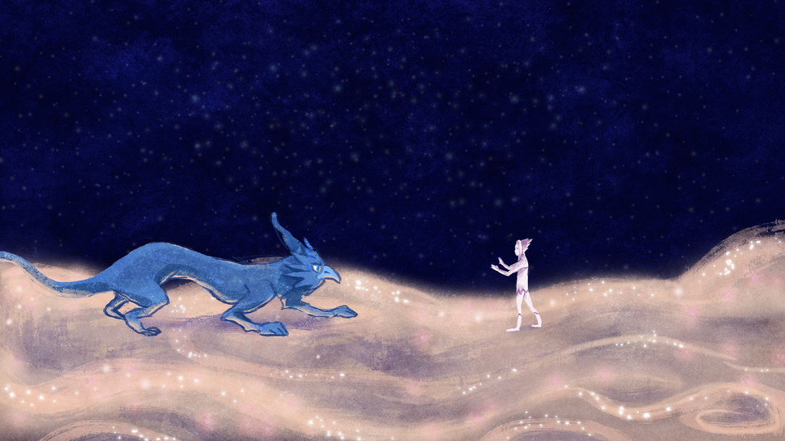
(Below) This was an image I completed on the same day, showing the girl transforming before the creatures eyes. This was a fun piece to finish and didn't actually take me very long.
LO6: There was no particular deadline for these shots as it was early days and not needed for a few more weeks, however I had it done in the same lesson she asked.
LO6 After finishing this, I was then given the task completing the following 6 boards highlighted (below). Again, there was no particular deadline so I had free pretty much as much time as needed to do these. However since I did not have much work to do for my other group, I decided to get these done as soon as possible to free up time in case more work did appear.
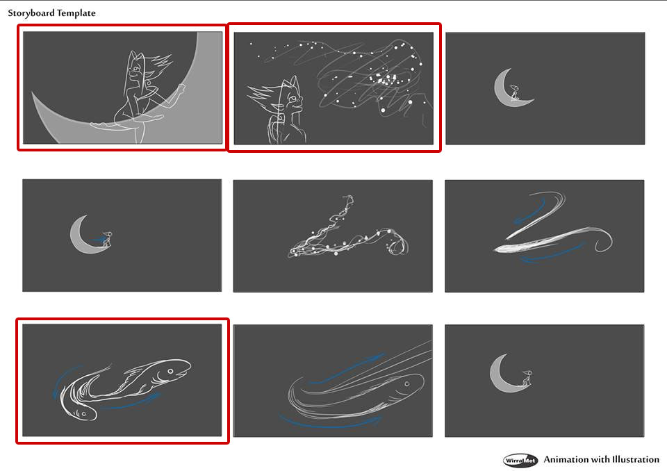
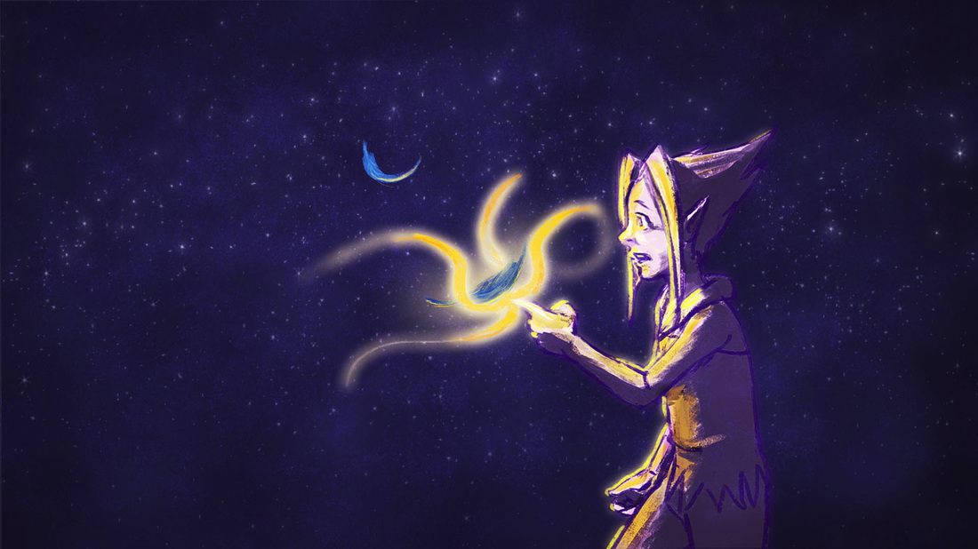
LO4: (Below)This is one of the concept pieces I sent her. I really liked doing this one, and I actually changed it a little from the storyboard image. In the storyboard (above), you can see the character is almost lying along the moon crescent, but I though it looked more natural in the pose I set.
LO3 + LO4 (Below) These are the same shots, but I had slightly different colour schemes for both. One was more purple, the other more blue. I did these so Rebecca could choose which one she prefered, and I like to give options.
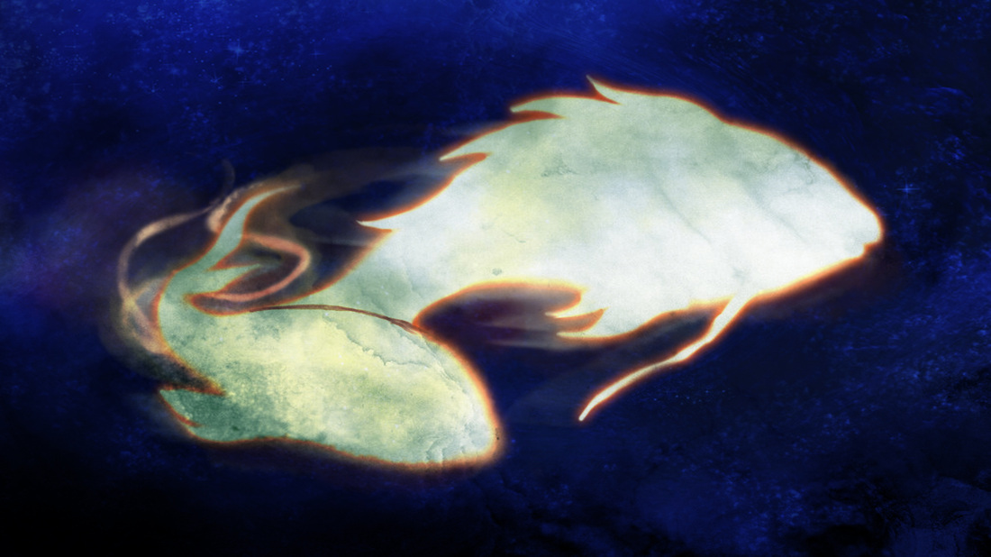
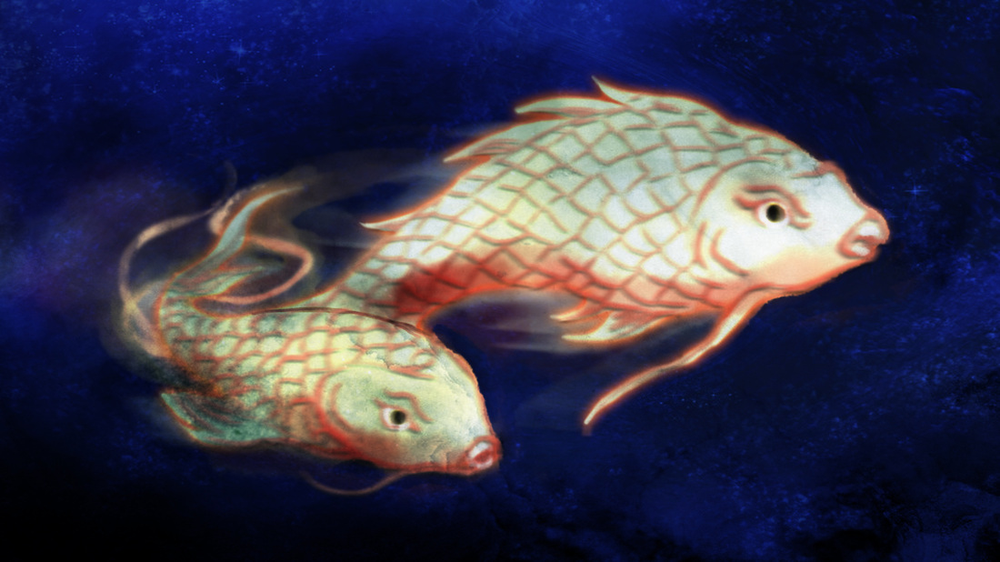
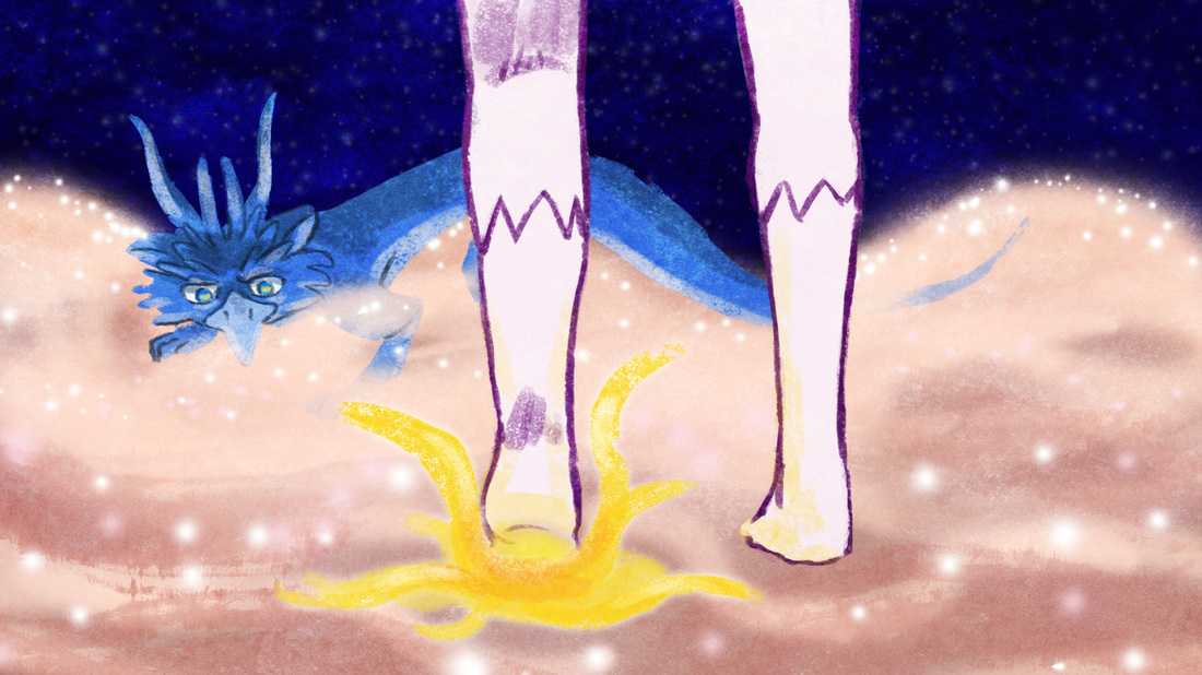
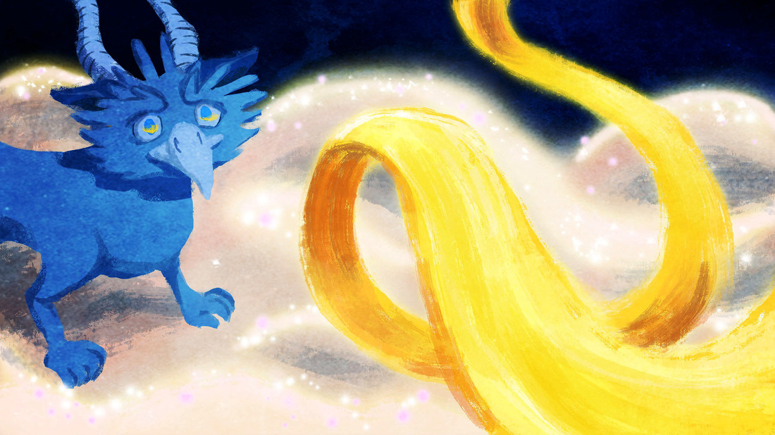
(Above) When I sent the first one, Rebecca asked if I could add the features and details of the fish. To be honest I found it really hard to draw a fish, but I used Koi Carp (below) as my reference and thought I made a decent effort in the second piece.
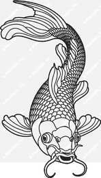
https://www.photospin.com/content/illustrations/full/424_2961963.jpg Accessed 12/01/15
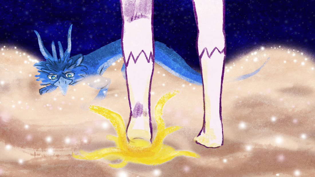
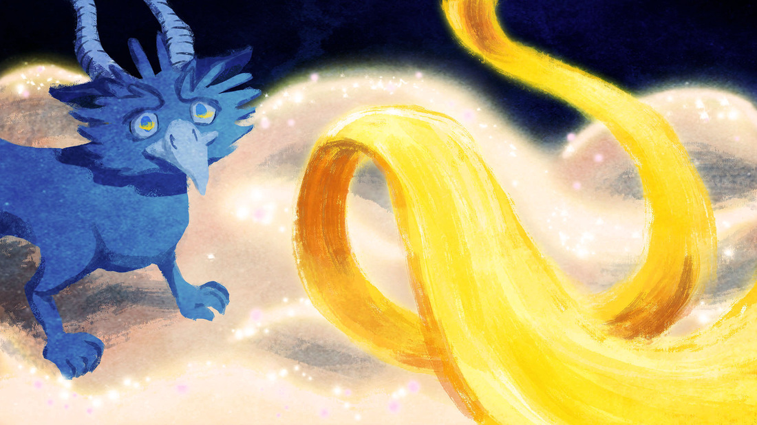
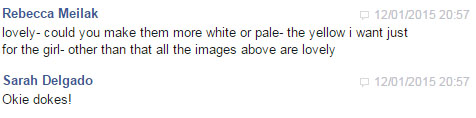
LO5: (Below) I got feedback on the more detailed fish and was asked to to make the fish more white as the colour yellow was more representative of the girl in her later transformation.

LO3: So I then went and changed the colour of the fish to make it look more pale. I was really proud of this image and I liked how ethereal it came out, especially the tail area.
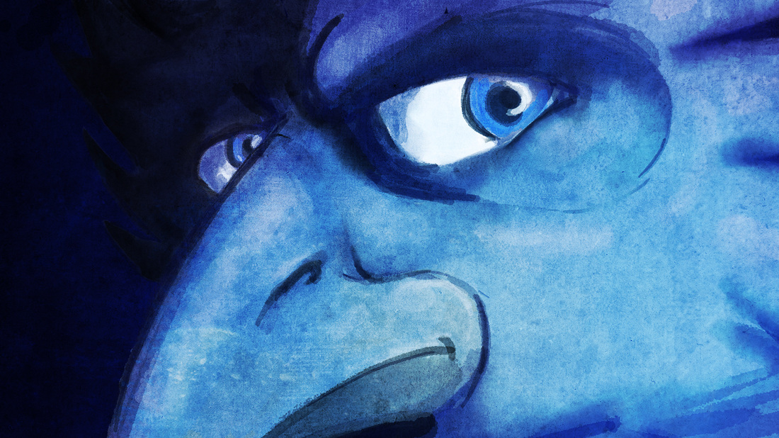
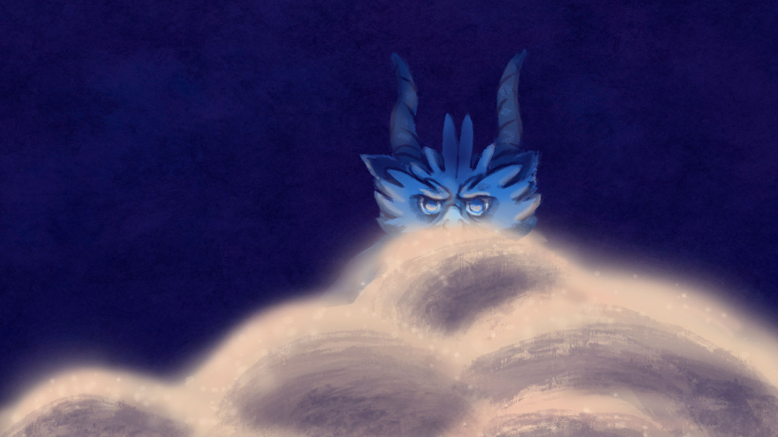
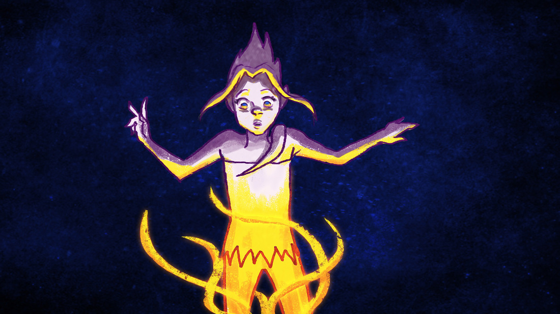
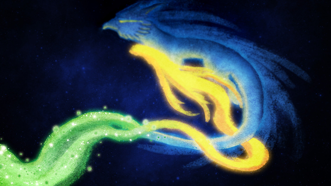
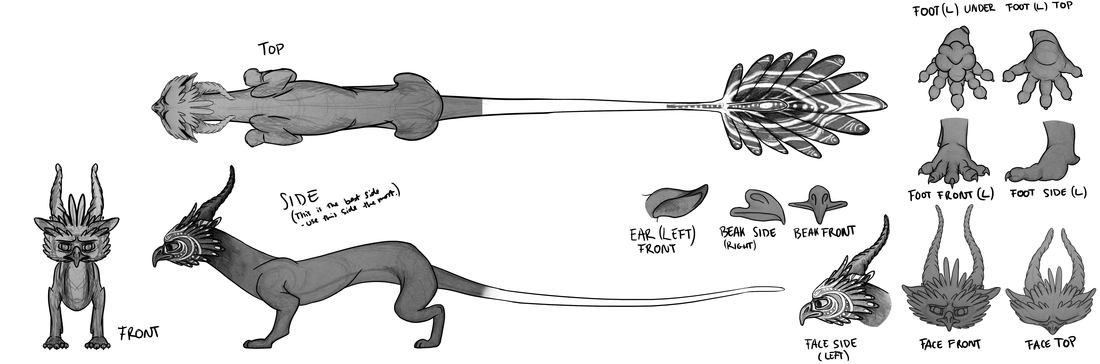
LO5 I got some feedback from Rebecca about the concepts I then sent her (above). The first the lines of the fish were too thick, and not so elegant. Also, the bird looked rather human and far too exposed and not mysterious enough. I had too agree. Again, this shows how I find it hard to draw animals and how I have the problem of making them look human (something I tried not to do for my earlier polar bear project). I must admit he does look a bit creepy.
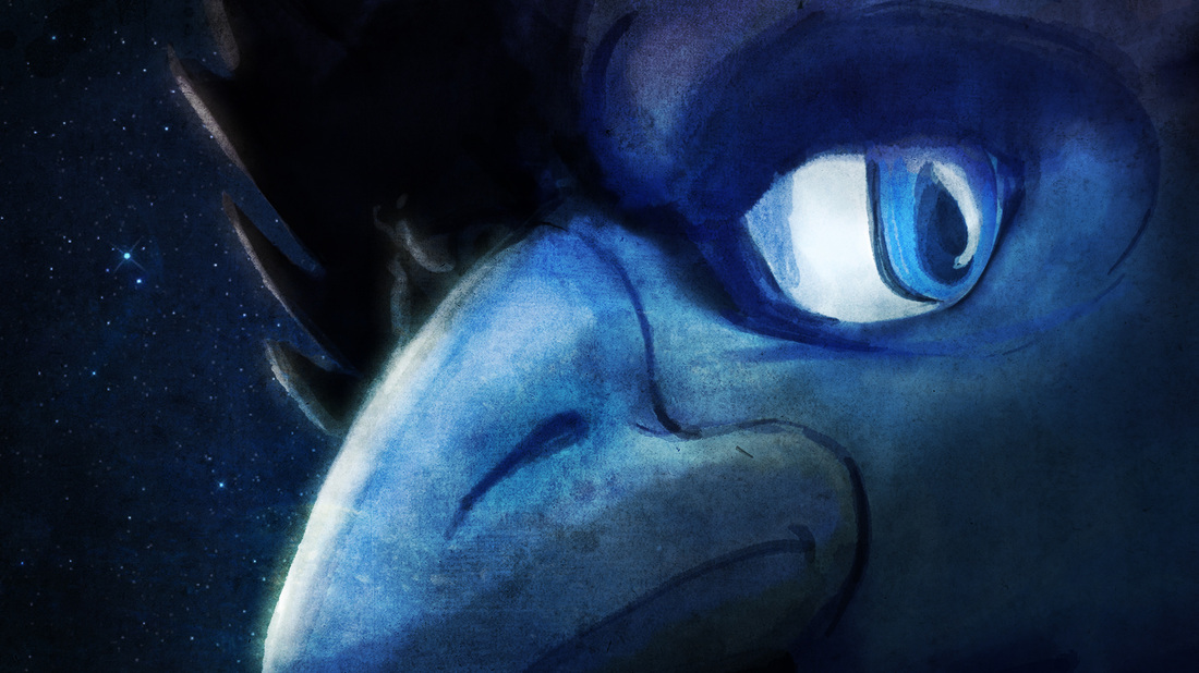
LO3: I then made the changes she asked for and gave two slight variations.
LO5 She then messaged me after I made the trails of the fishes thinner. She gave me feedback and said she wanted more wispy and irregular floors.
LO5 She then messaged me after I made the trails of the fishes thinner. She gave me feedback and said she wanted more wispy and irregular floors.
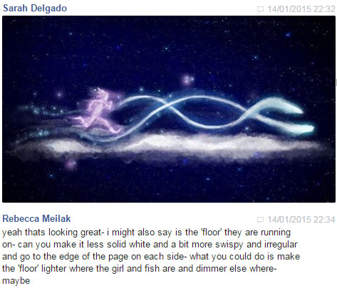

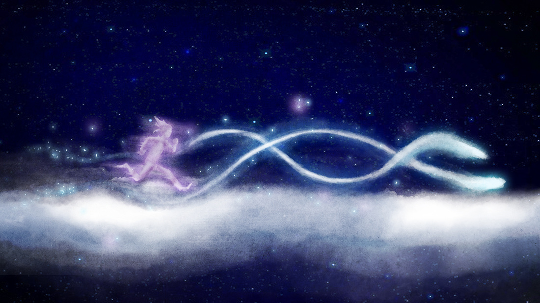
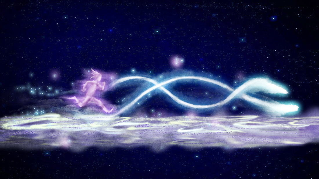
LO3 Here are a few variations I sent to her and she liked the third one most.
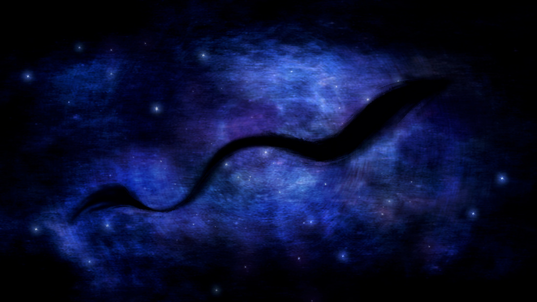
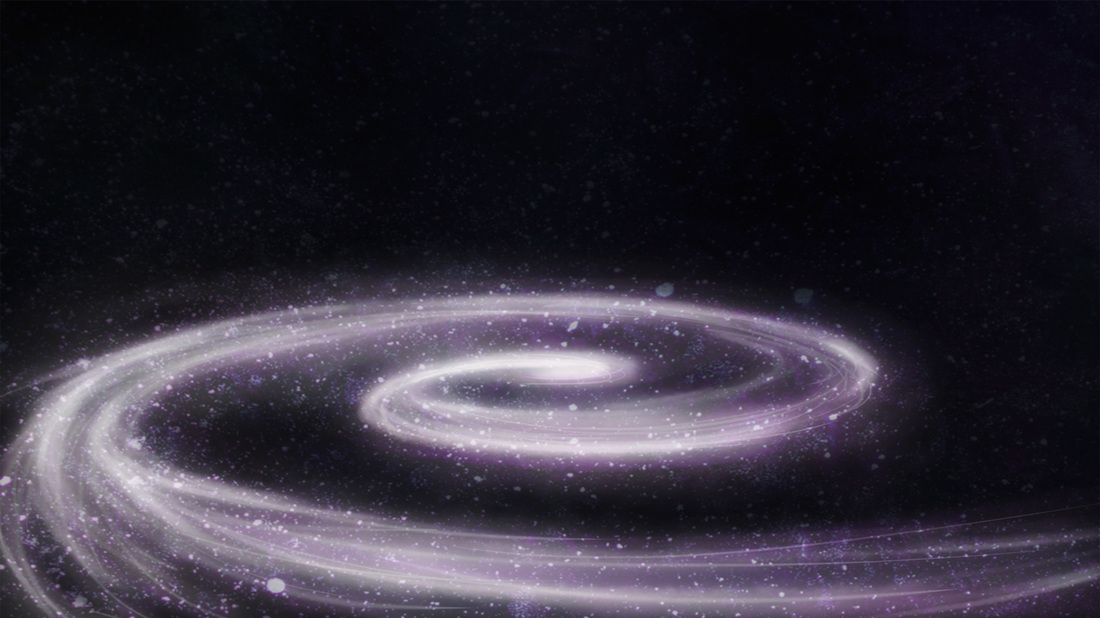
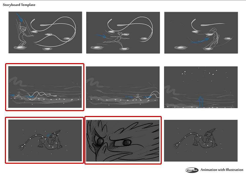
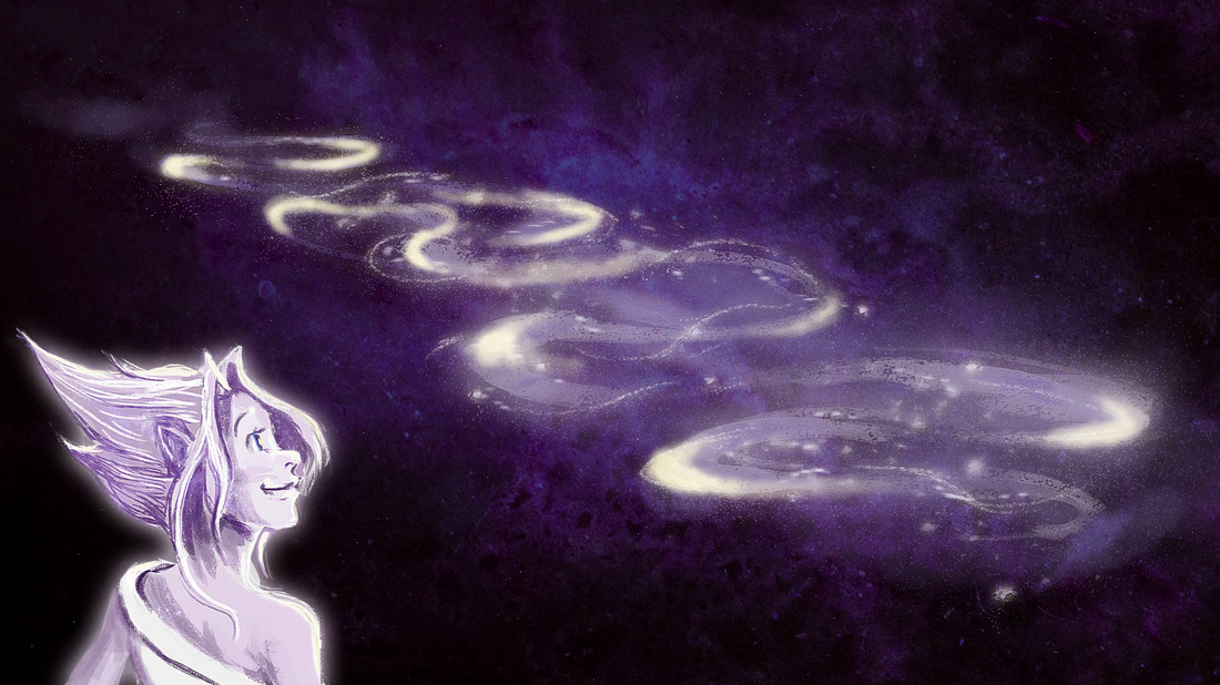
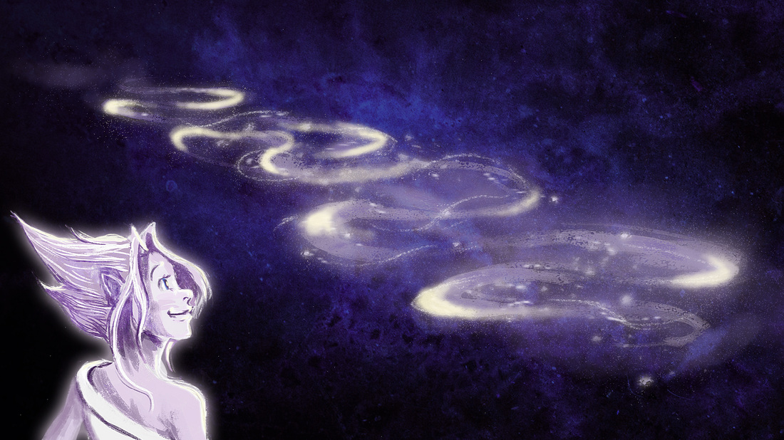
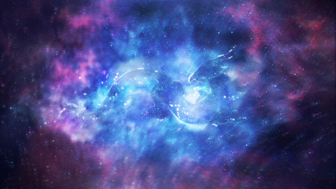
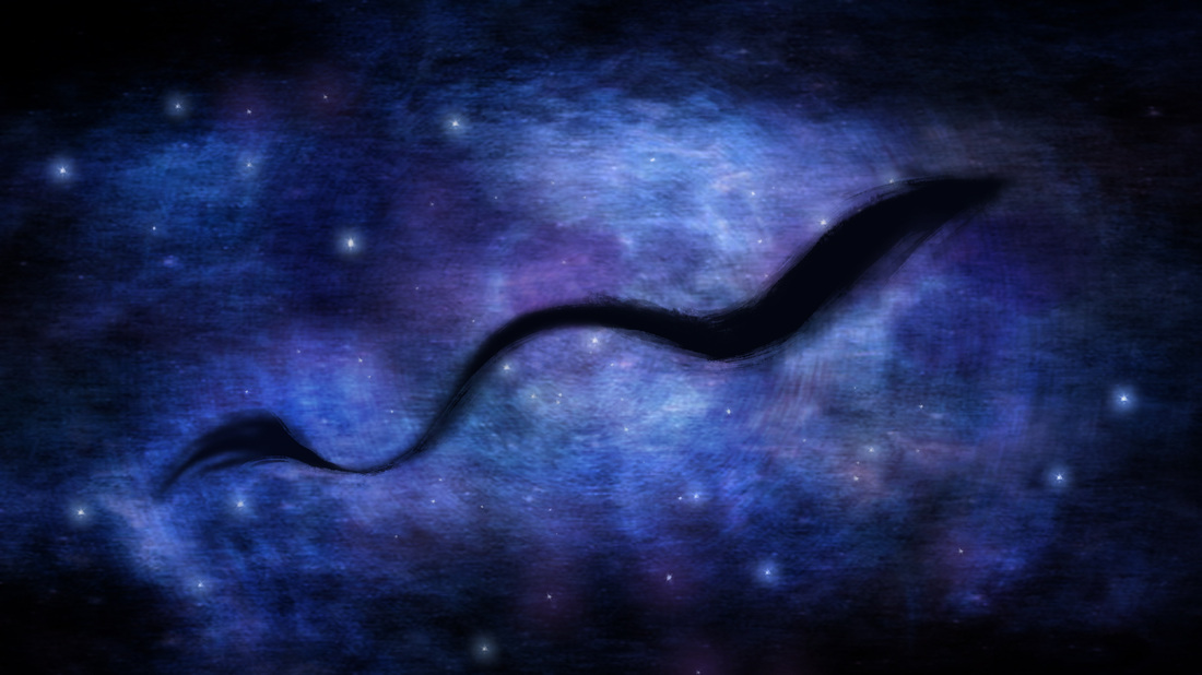
LO3 Below is another concept art piece I was doing for her where Draco was hidden in the stars. I presented her with these three pieces and await her feedback.
LO3 Below is another concept art piece I was doing for her where Draco was hidden in the stars. I presented her with these three pieces and await her feedback.
Week 4
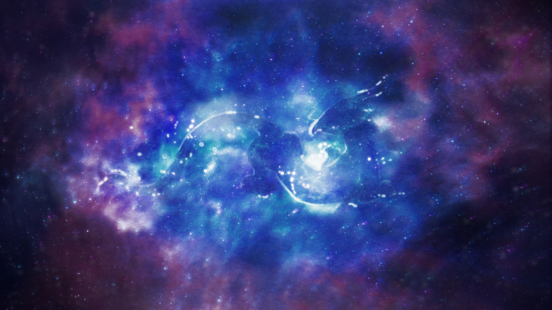
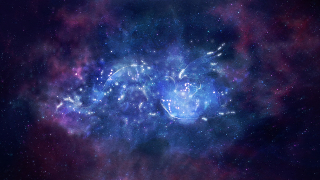
LO5: Rebecca sent me more shots to concept through google drive so I had reference as to what to do.
LO2: I made sure to refer back to her concepts to keep my work quite similar. This time she gave me a colour palette to work from whereas my earlier pieces were based on my idea of the colours.
LO3: Below are the final concept images done for Moon Child. I had actually rushed to get these done on time only to be told I actually had more time!
One interesting feedback I had gotten from Rebecca was that the later concepts did not seem as magical as the colours were different from my earlier ones


LO3: Below are some of the many variations I had of each shot. Most of them were colour variations which were very subtle, but enough to make a difference. I wanted to have different options just in case. Rebecca actually did not like these sets of concept art as much as my earlier pieces. She said the colours weren't as nice and I was actually using her colour palette. In the end she said not to use the colours she gives, but to use the colours I pick. It was nice to be given that freedom in the end, but it was a shame that these concepts weren't as well received.